(Current Studies, by blog description (2015-16)) - Click on each label to see corresponding posts!

Saturday, 30 January 2016

Theory - (By Dr Graham Lister and Lee Corner). An introduction to the works of Albert Bandura.

Outline of this semester's work;

The assessment for this module for this next semester will be based on 2800 words, (including captions).
1. Create five keywords as a three-dimensional representation of "where you want to be in five years time" and utilise your model created at the previous session to write approx. 500 words of a profile.
2.  Produce up to 10 images of your best work within a portfolio, with the intention of creating a personal website.
Use a suitable template which can be retrieved from the Association of Illustrators or Axisweb.com
  • Include an artist's CV, which should be a short biography and list of your exhibitions.
  • Display your own knowledge of your particular field of interest.
  • Present the skills that you possess in terms of how they would relate to the work that you are looking for.
  • Present the ideas and themes that you work upon through your practice.
  • Provide an artist list of exhibitions you would like to work with.
  • The images need to be captioned!
----------------------------

During this lecture, an interesting exercise was carried out to describe all the materials that we saw immediately in front of us within 30 seconds.

From just a short scan of the room, I found; fabrics; nylon, cotton, wool, plant, wood, leather, Metals; steel, copper, gold. Plastics; Formica, melamine, carbon, cartilage, bakelite, PVC, computers, silicone, glass.  -
The object of this exercise was to develop a mindset similar to that of a personal Safari on our journey through our observational life during the working day.

A further exercise was conducted which associated emotions, to the spectrum of colours; e.g., Red, orange, yellow, green, blue, dark blue, indigo and violet. The outcome of this exercise demonstrated that everyone's perception of those colours and hence the emotions that they evoked provided a different and unique experience from each and one another within the group.

A further explanation of the "Creative / Innovation Engine" was given of the work by Prof. Tina Seelig (of Stanford University, USA), regarding the Möbius strip which was shown at a previous session. Whilst a short video provided an insight into the theory, the conclusion I drew from this personally was to make the point of reframing questions, and the analogy was that the best jokes actually reframe expectations. Whilst many of the comments I may have felt as American management speak, with quite a few platitudes, some of the own some of the examples of alternative thinking such as the Japanese art of "Chindogu", or, "un-useless" inventions: which is, creativity by combining two radically different ideas together that are not obvious, seemed an interesting exercise.

All of the above activities were positioned to challenge assumptions!

To summarise;

  • Knowledge is a toolbox of imagination.
  • Pay attention all the time, don't overlook what is in front of you!
  • Attitude is the spark that gets us going.
With regards to the Tina Seelig innovation engine, the elements that make up the model should be shown in pairs.  For example; imagination and habitat; knowledge and resources; attitude and culture; are combined with external environmental resources and societal culture.

Conclusions to Part 1;

Whilst this model seems a good starting point I am concerned that it may overlook natural ability and adaptability; as the Möbius strip suggests that creativity looked upon and scrutinised through this process may be too prescriptive; I think there are other areas of importance, and here I am talking about the work done in the 1990s by Daniel Goleman on intelligence quotient versus emotional quotient; (in other words IQ/EQ); together with the seminal work by Karen Horny regarding positive mental attitude.

My own view is that there is a danger in creating processes of this nature that one complicates something that may, in fact, be quite simple.

Part 2 - Self-Efficacy;

The next part of the lecture discussed the work of Albert Bandura born 1925, a professor of psychology, also at the Stanford University, and his theoretical underpinning of self-confidence which he terms as self-efficacy.
"Self-efficacy reflects confidence in one's ability to exert control of one's own motivation, behaviour, and social environment."
Efficacy is often interdependent with efficiency, and both ostensibly mean similar things. Efficacy is the ability to get the desired result, combined with capability.

Bandura's theory is based on;
mastery experiences; social persuasion; vicarious experiences; and emotional status.

Each of these elements explored in a little more detail;
  • with regards to mastery, the more you experience success, the more you are likely to enjoy it in future.
  • With respect to vicarious experiences, by seeing somebody else accomplish something, will help you as an individual accomplish something too. (Similar to the old adage of birds of a feather flock together, but success breeds success). If at times you're struggling to find success through vicarious experiences, seek out a mentor.
  • Emotional status. Simply put affect the habit of positive thinking.
  • Social persuasion; this is about listening to praise and good feedback, whilst ignoring negative criticism and deconstructive comments.

See the video on YouTube regarding social learning theory and self-efficacy.

Conclusions to Part 2;

Following on from the last lecture yesterday, by Lou Bones of the AOI: one of the areas that I felt could be worth investigating is the provision of business services, coaching and mentoring for artists and illustrators in the North of England, to supplement legal and commercial skills for those practices. Whilst Lee is performing some of this activity, I think there is room to compliment it and help to grow her own client base perhaps?
Having mentioned this briefly also to Dr Lister, he explained that there was a similar business set up in Glasgow, for local artists along the M8 corridor which is known as WASPS. Workshop and Studio Provisioning services Scotland.

Thursday, 28 January 2016

Guest Lecture, - Introduction to the Association of illustrators by Louise Bones

The Association of Illustrators, (the AOI), formed in 1973. 

The AOI now has a membership of over 1800 people in the UK, (and that includes me too!)... It is a not-for-profit organisation which is particularly well placed as it sits on the panel for commissions and copyrights, therefore influencing not only United Kingdom law but also a wider audience in the rest of Europe.
As well as being part of the British Copyright Council it also sits on the British Rights Foundation committees.

The Association of Illustrators website provides portfolio facilities for artists and illustrators and their self-promotion. This is a shop window for connecting commissioners to artists. If a personal website is put onto the portfolio advises against creating contact forms but instead indicating directly email on the front page of your website.

A good example for website design will be out for "peepshow" which is a successful collective of artists and illustrators all feeding to one website.

If you do decide to start a blog, it is vital to keep it up-to-date otherwise if you have links that are out of date, or information that goes back, to say 2014, people will quickly lose interest.  If you are unable to update your blog regularly it is probably better not to do them at all.

In order to stand out from the crowd in today's illustration and artistic marketplace need to create your own unique aesthetic niche. You constantly have to revise your own presence, both in terms of the Internet and the web but also through networking and meeting people. A good example of an excellent presence and networker is work done by John Bergman for example "Drawings of girls as seen on Tumblr".

(Another really nice web presence on AOI is the website of Sarah Gulfgrand).

If you use Twitter trying to backup your Twitter with the drawing every day, but never, ever, publish a commission which is halfway through or in any kind of progress as this may be contravening copyright rules that you have already agreed with your client and they may well cancel the work with the.

Another good web-site to use is Behance, this is a great portfolio site as it is project based. For a nice example of a user on the Behance site, see the work by "Ben the Illustrator" as a guide.

One's presence is on the web, - all very well, but how do you then get noticed? Well, the answer is physical mail! There is no substitute for it. And A5 size is a good format which is the same as a postcard and provides a physical object for people to stick on the wall, - because almost every creative department has a pin board and so a postcard is actually a great sales and marketing tool.

Think about how you want to engage with your clients, and why you want to work with its own particular target company. Make sure that your passion comes through in the work that you provide as an introductory sample for.

Personalisation is very important. When addressing anything to potential customers or companies to work for major personal.

A number of websites which are very useful in finding commissioners and sources for work is bikinilists.com and the AOI client directory.

If, after you've left university, you do decide to go on your own and become a freelance artist or illustrator, it is vital to register for income tax within three months of starting up your business. Keep up-to-date accounts, and all your receipts. A proper audit / or paper trail is essential. From 2020, all freelancers will have to do their own tax returns. You can claim lots of tax breaks, however, and this is a very important area to familiarise yourself with. You can even claim cultural trips and cultural knowledge learning et cetera.

Copyright.

Copyright means quite simply the right to copy. The right to copy somebody's work is held by the originator and for 70 years after they die.
There is a difference between physical property and intellectual property.

  • Physical property is your actual painting, the original artwork, or the electronic file that you've created, using photoshop or other software. 
  • Intellectual property, however, is what are actually copywriting and it is intellectual property which holds its value. 

You cannot copyright an idea or style. If you copy a substantial part, it will infringe copyright. However, the actual rules say copying a substantial part, "in part, or in whole," infringes copyright, therefore a photograph of someone else's is clearly an infringement if the whole is copied, but what about a single person from a photograph? All this is a part of the photograph and therefore, that too becomes an infringement. Just by copying a part or image from the work, no matter what the size of it is, could infringe on copyright and you are liable to be sued by the originator or the creator.


Copyright assignment.

 The short answer to this is, don't do it!!!  Only ever consider the assignment of copyright for a business logo. If for whatever reason you to sign a contract to assign the copyright, then the money, i.e. your fee, needs to cover your entire lifetime, +70 years of value. You can see why the assignment is such an important thing to avoid. The reason why you mustn't assign a copyright is, - quite simply, you lose control of your work. It means they can change it for themselves and charge their own money and fee to other users. In practice, clients don't need to own the copyright! -  owner drawing or illustration anyway, whereas licensing is mutually beneficial.

Moral rights.

There are a couple of moral rights that you need to be aware of.
 The first one is the right of paternity. This means it is your right to have the work credited to you. The next right is the right of integrity. The right of integrity is to say that the right of your works are not falsely attributed to you. However, one should note that moral rights can also be waived. Moral rights do not apply to newspapers or magazines, is usually the artist and author credited in these documents in any event.

Rights online.

 Always always protect your work online so that you can always be identified as the author. Only ever copy and upload low-resolution files of 72 dots per inch. And, make sure you put your name into the filename to upload as a minimum. Use the copyright symbol on all the documents together with your name on every page. Read the terms and conditions of websites, as orphan works, can easily be copied. Orphan works are those works where no originator can be traced, as there is no information held within the file as to its origin.

Pricing.

Do not ever work for free,! It undermines the whole industry!
The price you are paid is based on the usage of your artwork, not for your time. Therefore, each time a piece of your artwork is used, it has a value.

Pricing has nothing to do with experience! The career stage that you are at, is completely irrelevant!

Quote prices accordingly. Never be sucked into a conversation which is "we need a ballpark figure" because this can set your pricing for the remainder of the engagement without you knowing anything about the real reason for the work being commissioned.  -  Accurate pricing and licensing is mutually beneficial as you both have been professional. The illustrator or artist and client jointly should know who the end customer is going to be.
You need to know who the end customer is so that a price can be judged. In fact, as the seller of your own work, you've got every right to know!...

This is the only way that you can price something accordingly based on its value.

Think of it this way... If you telephoned a painter and decorator and asked him to paint your front hall, would he provide a ballpark figure over the phone without coming to look at the work in hand? His question would be to look into seeing how difficult it is to paint.... He would want to know, is your front hall the size of the telephone booth? or is it the size of the Albert Hall?

In order to accurately price a work, the following information is essential.

  • The client profile,
  • The intended usage,
  • The territory or area in which the artwork will be used,
  • The duration of the licence in years or months,
  • The anticipated budget that the commission has already set?

... but this question is open to some debate as it is at this point which the value needs to be pre-understood by someone.

By always simply asking for details, it demonstrates one's professionalism, but also it makes for a much more accurate costing to be provided too.

Make sure you research your client as much as possible. How can you illustration fit with their existing branding?...

Advertising.

There are two types of advertising, above the line and below the line.

"Above the line" advertising is when the work will be paid for by an outside client and it is going to be used outside of the business for which it is advertising. In other words, the work will be seen by the public.

"Below the line" advertising is what is in-house, on the cutomer's own premises, and will not be seen by the public.

A typical example of one piece of work for a large company,  with a fee limited to UK licence to use that work for up to one year, is between £6,500 to £7000 just for one illustration.

For a small company however, such as a hairdresser in town, just down the road, the value would be very different. With that situation, we're talking in terms of between £300-£450 for one year's usage.

Tuesday, 26 January 2016

Major Project - Playing with the ideas of Affect and scale....

Searching for the approach to the production of artifacts for the Gallery & Exhibition, I created a number of large doodle sketches which I intend to use as a rough template for a wire frame base, for further sculptural work.

Both these drawings were created on Fabriano 140gsm, with 2H and 2B and 6B pencils; Originals are approximately  210 x 590mm and 420 x 590mm respectively.

In discussing the book (suggested by Dr Holmes), by Steven Shaviro, "Post-Cinematic Affect: on Grace Jones, Boarding Gate and Southland Tales." (2015)...

 This book was based on a thesis provided by Steven Shaviro in 2010, whilst at Wayne State University USA, which I managed to get hold of a copy, via;
http://www.film-philosophy.com/index.php/f-p/article/view/220/0

In this extended article, published in Film-Philosophy Magazine (Vol. 14, No.1), Shaviro talks about Jones and Argentino, together with Timberlake, (the main actors / characters of the three titles of interest in his writings): Shaviro talks about the fact that as figures of post-cinematic celebrity status, they are continuously interrelating through various media environments such as reality shows, talk shows, record recordings, charity events, films and music videos et cetera, together with the traditional mediums of newspaper and gossip columns.

These celebrities appear to us to be "everywhere and nowhere" at the same time.

Our engagement with them, therefore, seems to be highly affective and our perception of them whilst we emotionally engage with them is also ironically distant and mediated from us.

Shaviro suggests that even though they are very familiar to us all, they are also out of our reach. Even when they are publicly humiliated through various life events and we feel really strong emotional connections with them, we are unable to share in their pain completely because we simply do not know them.

Whilst they undergo all the usual humour of human frailties and vulnerabilities, they also appear to possess stoicism of complete invulnerability through this mediated experience. Even though we engage deeply at what seems a personal level, they have no idea who we are and so two-way feedback of 'knowing', in a social sense, is impossible. (Shaviro 2010, page 9).

Saturday, 23 January 2016

Theory - Contemporary Art - Dr Graham Lister & Lee Corner

As an introduction to the new semester, Dr Graham Lister and regional arts fund director, Lee Corner, provided an introduction to the next 12 weeks of theoretical study. The University of Huddersfield is particularly unique in that the Chancellor, Bob Cryan, is very interested in the establishment of self-employed individuals and is keen to help the establishment of small local based business around the Huddersfield area. Both Bob and Lee sit on a government panel for local funding of new venture businesses.

A little exercise was undertaken to warm the group up, which I thought was a nice touch!... Lee gave everyone an opportunity to make a three-dimensional "representation," to help us articulate "where we want to be, in 5 years time"... Having done similar exercises before, I was pleasantly surprised when a bag full of plasticine was handed to the students!...

Various outcomes were crafted to show what each student would like to be doing in 5 years from now, but in my case, I thought for about 3 minutes before using the final 2 mins. to create a representation of a dear little chap, and who's creator was Peter Lord at Ardman Animations, who, with his friend (or perhaps his guide...), that being the popular children's artist, Tony Hart, (1925 - 2009), was very influential on my creativity.  And here he is!

"Morph", First created by Peter Lord (1977)
I chose to create a copy of Morph simply because nobody really knows where they will be in 5 years time, but what I do know, (and this is really a life lesson to anyone), is that wherever I am, I will have "morphed" into whatever role in life there is out there....

With regards to the practical work for this module, one of the main outcomes for each of us will be to create suitable portfolio resources for our practice, and potentially for future placements or work engagements. It was suggested that we look at to portfolio websites;

  1. The Association of illustrators
  2. Access Web.

It is recommended to look at the artists tabs for biographies and artists statements and it may be possible to use some of them in order to create a template for an appropriate profile.

Once we have created these, we will then use them as a link for turn it in, which will include an artist statement, a CV and positioning document, and a selection of works for a "starter" portfolio.

The correct type of statement in order to get commissions are crucial. Likewise for commissioners they read these statements with a fine tooth comb. One has to demonstrate reliability through a proven track record, you can't just say that you are reliable!    Commissioners and others who are looking for people to fulfil artistic projects surf and skim over thousands of images, so it is obvious that whatever we provide has to clearly stand out head and shoulders above other works that you may find on these types of portfolio repositories

It's also important to state your location, and whether or not you are able to work anywhere in the UK, or if you prefer to just limit your work to a particularly busy county, such as West Yorkshire, greater Manchester, or the London area or wherever. Likewise, it is also important to give an indication of how you charge for your work, but keep it vague.

The deadline for this work will be the end of February.

We also discussed the idea of Stanford University's Prof. Tina Seelig's Creativity Attributes, and their internal and external facets.

----------------------------------------------

[ I took a peek on-line and a link to some interesting work can be found here]
http://cacm.acm.org/system/assets/0000/7705/041712.Tina.Seelig.Color.Innovation.Engine.jpg

And also, take a look at:
http://www.creativitypost.com/create/tina_seeligs_insights_on_creativity

-------------------------------------------------

In the forthcoming weeks, we will also look at ambiguity and uncertainty; the subjects of congruence and living your own values, together with the ideas of presence and reputation will be explored too.

Conclusions;

  • The underlying theme that I drew as a conclusion was; that whatever I create needs to provide some solidity in what I'm trying to get over as a message, together with actual evidence to back up my claims!
  • As I already have a website established, I need to spend quite a long period in getting this up-to-date as it is almost a year to 18 months old!
  • In a way, this is fallen pretty well because I want to begin to use Adobe Dreamweaver to such an extent that I can get associate certification for that package and, therefore, include that within the website itself. So I see this is a great opportunity to experiment in web design much further.
  • I remembered the book by Karen Horny entitled "Feel the Fear, but do it anyway" and "Embracing Uncertainty" which is an excellent starter for further reading. I'm sure I have a copy of those books somewhere....


Friday, 22 January 2016

Research and development - studio practice tutorial

I was lucky enough to have a studio space tutorial today with Dr Dale Holmes. I described my intention around creating an oversized large fragment of the broken gnome as discussed in an earlier blog.

 I also explained how my idea develops further to explore the ideas of kitsch and the work of Jeff Koons and I posited the question to Dr Holmes about covering the plasterwork in gold leaf affect. Whilst this may be reference to a "TK Maxx" kind of thing, it's worth experimenting with?

Dr Holmes suggested that I looked at an idea that may help with my imagination, as he recalled the television series entitled "Breaking Bad" and in this particular edition the whole show was an obsessive exploration of the unknown object. Basically it follows the protagonist in his obsession to retrieve an unknown object that has fallen from the sky into his swimming pool. It might be a good lead to think about, if I can find that particular episode.

Also try to look at the work by Steven Shaviro, and the book Post Cinematic Effect. (I'm glad to say that later on in the evening I was able to find a magazine article from Film Philosophy Magazine written in 2010, while Steven Shaviro was a professor at Wayne State University, United States).

Conclusions;

  • I need to create something to show my journey over the last few years, and whilst the golden artefact might be appropriate as a reference to the contemporary, maybe I really need to think about producing something which is a reflection of my student learning experience.
  • A very large plaster cast fragment will provide enough curiosity, and yet retain the reference of academic narrative.
  • I think it will be a sufficient narrative to provide this enigmatic view of the journey I have personally taken over the last three years.
  • Because I will make a series of these casts, it makes sense to make a number of different versions in order to test each one for its own built-in intrinsic affect.
  • The academic document entitled "post-cinematic effect: on Grace Jones, Boarding Gate and Southland tales, written by Steven Shapiro in 2010, seems to be an excellent source of theoretical material closely linked with the research that I am currently undertaking. I will go through this document which is some hundred and three pages long and provide a summary a later blog.

Thursday, 21 January 2016

Research and development - weekly briefing

I'm looking forward to the new years intention of holding critique groups, where on each Tuesday groups of up to 10 students will engage where half of them provide two or three pieces of work and present it to the group, whilst the other half of the group provide positive critical discussion for those presenters to engage with.

It was explained that this would be a kind of test bed in preparation for the graduate exhibitions later in the year and so what we will need to do is select particular pieces to provide the best links to our own lines of enquiry. Peer to peer feedback within an environment of controlled and specified rules of engagement should prove to be a very worthwhile exercise; and I recognise that this forum will provide a wonderful opportunity to develop not only my ideas but also my confidence in displaying my artworks.

I need to ensure that the workspace will be pre-set up in plenty of time during the previous week and few days before the specific critique group that I attend. My objective will be to create a visual discourse of my work that feeds into my blog and vice versa. Therefore it is understood that the work should do the presentation itself, and there should not be any need for additional presentation vehicles, such as PowerPoint et cetera unless absolutely necessary.

Tuesday, 19 January 2016

Start of a new Semester, and I'm raring to get back into the studio!

Spending some time in the studio today thinking about my next stage of research into all things gnomic, I have been forming the idea of picking out the abstract, part of the broken gnome face.

I started by making a rough sketch of the initial size that I propose to create this fragment of a gnomes face. At this stage it is relatively small, being approximately 600 mm x 300 mm or so.


 The method I will use to create the fragment must be able to be done reasonably quickly. The outcome or artefact needs to have the capability of itself being fastened to the wall for display purposes, so I will likely use wooden batons to brace the object.

Having thought for some time about how I am going to create and render an appropriate fragment of the face that I have already chosen, I have been thinking about using a fine wire mesh cage, onto which I will layer plaster of Paris, or more slower drying regular wall plaster. I've also been thinking about the materiality of the object and have come to the conclusion that it may be worthwhile to experiment with future copies of this first artefact, by using different substrates of material such as Appia mache made from shredded personal documents, such as bank statements, mortgage advice notes, bills and invoices and other such identifiable paper stock. I might also add dust and detritus to the patio mache and try to incorporate it with the mixed plaster? By doing this I am then true to my intentions of using these materials, when I created my first planning sheet back in October last year. So onto practice then and the first thing I need to do is to order the chicken wire mesh so that I can get started!

Monday, 18 January 2016

Theory Essay - Completed - Hoorah!

At last I have managed to just about finish my essay, which has been a real mental wrestle. Nevertheless, I'm quite pleased with the results as the structure, now that it has been rewritten, is a lot easier to understand.

I've decided against creating an abstract for the document, simply because the introduction has been condensed into one page anyway, and so the need for an abstract seems to me to be superfluous.

The skeleton of the document seems to flow such that it provides an interesting explanation of what artistic affect actually is, a discussion on what affect theory is and where it has developed from, why affect is important to art, and then this initial outcome suggests the concept which could be used for the creation of art in future (with affect being a conscious component of the production process)

The document then goes on to explain how because grief is a social construct, it could be suggested that affect through grief is also socially constructed and it is here that I have used the works of the early new European painters to contextualise the development of affect through grief.

By using the latest proponents of the new European painters, including Luc Tuymans and Bracha L Ettinger, I have combined this with the idea of Heidegger's broken hammer analogy to explain presence and nonpresence in order to articulate grief and loss together with the object oriented ontology of Heidegger for my own practice.

I have left the door open for more research in the conclusions section of the essay as I think that there are opportunities to develop a deeper and wider understanding of affect in engaging with other artworks, to trigger and stimulate different emotions, for me to have more creative ideas to engage viewers with.

Conclusions;


  • By writing and then rewriting this essay in so many iterative versions, I have been worried at times that I may be drifting from the core intentions of the essay. However I'm quite satisfied that the final document can be held up as my best attempt at satisfying the criterion for this theory module. I do hope it meets the standards that I believe my tutors have inculcated to me.
  • I hope that by leaving further research opportunities that I will be able to pursue these during the rest of this semester and the new calendar year, and I am now quite excited to get back into the regular cycle of production within the studio both at home and also in the University facilities.

Tuesday, 12 January 2016

Theory Essay - It's beginning to form into something I'll be proud of!

Having spent most of last week rewriting the essay, I feel a lot more confident and pleased with the outcome of the document as it seems to flow so much better than my first attempt which I seemed to stick with for the month leading up to the Christmas break.

I keep toying with the ideas of Anselm Kiefer simply because his artworks have been such a strong influence on what I'm doing right now. Therefore I have decided to compromise a little bit more with Mike's suggestion a month or so ago to remove him. What I have decided to do is to use Anselm Kiefer as an opening artist in order to set the scene of how society can shape the notions of grief and reflect this in the works that Kiefer produced in the 1960s which were charged with affect.

By writing the essay in this way and showing where he found his influences from, through the works of George Baseltz, with whom he shared similar provocative ideas with, I can position more recent paintings by Gerhardt Richter in a better way to link with the more contemporary paintings of Luc Tuyman's and Bracha L. Ettinger.

On the back of those works, together with my understandings of the theories of Martin Heidegger, I have moved the document forward much more to demonstrate the ideas of affect being generated through imagistic notions of grief and loss in a more constructive contemporary synthesis of ideas.

Conclusions;


  • I'm a lot more confident that the structure of the document is right for my ideas to be transmitted and communicated.
  • I will provide some background information about the German culture and society post World War II, so that it contextualises why Anselm Kiefer, George Basilitz and Gerhardt Richter started to create the artworks in a kind of new expressionism based on the works of Edvard Munch during the late 19th century and early 20th century prior to World War II commencing.
  • From this I can then create a logical conclusion based on the previous artists for the work of Luc Tuymans and Bracha L Ettinger which then leads into my own work. There is still a lot to do, but the goal is well within reach now.

Wednesday, 6 January 2016

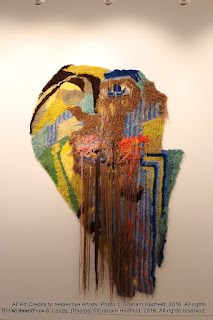
Gallery Visit - Research and development - The British Art Show - 8, Leeds.

I took a day out today from writing my essay, to visit the British Art Show that has been posted at the Leeds art gallery for the past few months. It was well worth the visit, as it provided me with a window onto this exhibition (British Art Show 8) that is travelling through the UK, displaying in their own words "an overview of some of the most exciting contemporary art produced in the UK".

For the purposes of this blog, all credits are given to all of the artists that have made this exhibition possible and I have attempted to copy a list of their names below.


The following pictures provide a sample of some of the works that engaged my imagination, and whilst I would have liked to have specifically included all of the contributors, both space and time within this blog preclude me from doing so.


--------------------------------------------------------------


----------------------------------------------------------------
-----------------------------------------------------------------

----------------------------------------------------------


--------------------------------------------------------------------


---------------------------------------------------------------

 Jesse Wine;
A sculptor  where inspiration is drawn from everyday objects / daily life, including sportswear, food and tools.


Exhibition credits for all these works must be given to the excellent work of curation by Anna Colin and Lydia Yee. The exhibition was organised by the Hayward Touring and Leeds Art Gallery with additional support and funding by the Arts Council England, Strategic Touring Programme.

Book Review - "Rethinking Art" (2008) by Steve Shipps - Part 4

The journey has taken us from the classical notions of art and the very first meanings of the word 'Art'; that is,

  • the Greek 'techne' i.e. something that is made or created;
  • to 'art' meaning sensory perception or sense perception;
  • then through the next 'mimetic' stage which lasted virtually 1500 years concerning the rendering of images or statues to make them almost appear to be a reality, (with the most significant changes happening during the Renaissance);
  • through the modernisation of art, greatly influenced by the works of the Enlightenment period of the 1750s;
  • then the period where accessibility of art to the middle-class expanded, (together with those actually classed as middle-class as the clerks and mill owners, accountants merchants and traders wealth could afford them). 
By this time, (around 1829) we had got the first stirrings of photography and by 1840, true commercial photography had been born (through pioneering work by the Englishman, Henry Fox Talbot, I might add!). It didn't take long for it to get around the world either, - the quickly growing middle class loved it especially!
Then we found ourselves at the end of the 19th century testing the true nature of art, mixing it with philosophy, trying to find that essence of meaning, so it takes almost another hundred years of modernism and to a period around the 1950s.
I've taken perhaps a bit of a giant leap, because the first half of the 20th century, in a cultural sense, had actually undergone a massive turmoil. Since the advent of Cubism, and Modernism in society, as well as in art, we had also undergone two World Wars. My own personal belief, (for what it's worth, and here I am definitely going beyond the discussion that Steve Shipps has in chapter 4 of his book), is that these two World Wars caused something in the Western drive that went well beyond the rate of progress in technology that perhaps had been occurring in the last 200 years. And that rate of progress I am talking about affected everything on the planet, not just art and culture, but manufacturing and, then by now the 'juggernaut' of industrialisation of the West. Much of this manufacturing industrialisation was in fact in order to feed the war machine. This is something that artists traditionally don't like to talk about, because we're quite a passive and empathic lot, rarely aggressive or confrontational...
So here we are, having arrived at a time at the end of the Second World War, where it seems that society in the West (which arguably might really mean the northern hemisphere), began to split into political socialism, seeded at the turn-of-the-century following on from the ideas of Marx and Engels some 50 years earlier in 1850, through forward now, a hundred years to 1950 and the post-war Eastern Europe and Russian Communist Bloc.
And so, like a boxing ring announcement...
- "In the West corner... The United States of America, and in the Eastern corner, ... the United Soviet States of Russia".
The battle, - or "race" was on, but interestingly, in this game, all the rules of previous battles seem to have been just left to the history books. The game was still about status, and the comparison of 'who had the biggest "X", "Y" or "Z"s and a lot more, which arguably was all to do with egos, rather than the ideas of "right and wrong", (whatever that might mean too?). So whilst war was over, there was still a lot of military statuses and ego massaging, and a great deal of squaring up and posturing going on.
This was the period known as the Cold War.
Whilst shots were not being fired directly between east and west, (except in places of the globe with those dreadful "growing" pains, - such as Vietnam and Cambodia) the real race for the status prize was to get the first man on the moon.
The massively developing engine of industrialisation was therefore switched, in some degree, from instead of just making armaments for feeding the war machine, towards being pushed to feed a new mouth, - in the form of "the space race". The leaps in technology from the mid-1940s after World War II, for the next 30 to 40 years greatly outstripped any calculated or forecasted developments that had occurred over the previous 2000 years.
So coming back to the point, and that is, Steve Shipps discussion in the development of art, there was an awful lot going on in the first half of the 20th century, in almost every other avenue of human endeavour.
By the 1950s, whilst traditional and classical artists continued to develop their craft, they became more commercial, and so had to conform with an expectation of a highly expanding need to satisfy consumerism (and the after effects of new, hugely aspirant, middle class-dom). Illustration, therefore, and perhaps what we tend to call graphic artists, today, were fully engaged and committed to this mass-consumerism through advertising.
However there was a different type of artist, still trying to pursue, and reductive-ly define that extremely elusive attribute, that essence of art and what it means. These individuals were almost outside the class structure; - the deep thinking philosophers of art in that time. To accompany these, a new breed of highly intellectual critics, some of whom were not even practising artists at all, started writing about the legitimacy and validity of this highly intellectual exploration of art...
 At a lower level (from world leaders), the same status and ego posturing was also flourishing (and of course still does to this day), in elite circles, in which, many of these critics, but also the artists they were discussing (either intentionally or not), readily found an audience willing to pay high prices for their new and very special unique interpretations.
A good example that Steve Shipps has used in his book is that of the work of Norman Rockwell, a highly respected and extremely successful commercial artist and illustrator, who produced many representational images of contemporary America for the Saturday Evening Post, a very popular weekly magazine of the 1950s and 60s.  He was practically flogging his work on a 'day rate' basis, - like all other commercial illustrators and artists were probably doing.   Shipps contrasts Rockwell's work with the type being produced by Jackson Pollock and Yves Klein and other abstract modernist painters at that time, who were also classified by the critics and the academics within "the fine art" category.  Their work was selling for thousands and thousands of dollars. -  Rockwell, however, was relegated very much to the "low art" and illustrator status: as his works, and that work of other commercial illustrators like him, was pretty much ubiquitous, being used in advertising as well as news media.
It appears then, that art by this time and split into two, therefore. On the one side we had 'fine art' as defined by the critics, the elite and the academics, and on the other, 'graphic design' and illustration for mass-produced consumerism.
For the public, - it was very difficult for them on the face of it, to have any need to try to understand "fine art" in the same sense (and it could be argued, the easy to understand), against the low art, or representational art of the commercial illustrator.
As a result of this division, it seems the gap between the two got even wider and wider.
The elite, the academic and critical "fine art" was still chasing the essence, having by this time found that essence as "an idea". (-  It was Joseph Kosuth in the 1960s who famously created the concept as "Art As Idea, As Idea").
By this time, high art had gone beyond the visual image (particularly that created with a brush and pigment against canvas). By now it was gloriously engaged (with the critics mentioned earlier), in "language". Artists were searching linguistically for new ideas to be communicated, perhaps because they had run out of visual ways of articulation?
By the way,  - during the late 1970s, on the back of the outcomes of the Space Race,  I, (together with many others), were discovering the magic of highly miniaturised transistors, which at that time were being fabricated so to fit thousands of them onto a silicon chip.  (- Bear with me on this one)..., I say thousands because then, we were dealing with a new dawn of an age of miniaturisation... By 1979, there were 'tens of thousands' of transistors on a chip made from silicon. - It wasn't long within the next couple of years for 'hundreds of thousands' of transistors to be reliably, and literally, grown onto a silicon chip. - What had been discrete components had by this time become able to be embedded into one single microprocessor. We saw calculators and electronic watches as the most personal piece of electronics during the late 70s. By the early 80s, we had the Apple Mac and the first IBM PC. The Apple Mac, in particular, was a massive breakthrough for commercial artists, particularly illustrators and printers.
So what could 'fine' artists do next? Art had been reduced to its essence, - pretty much anything could be art if there was some idea behind it, no matter how tenuously linked it was to an object. Even pre-made things had already become art, "just because someone said so", like Duchamp's famous Fountain, back in the 1920s. (But what was important is who said so). - Duchamp was already a very famous artist so he had immediate legitimacy and validity.  - Equally, if a very famous art critic said that something was art, then it to instantly became legitimate Art with a capital A.
Conceptual ideas, the "Conceptualism" of the 1960s and 1970s, in a way, gave art a bit of a bad name, simply because many of those who were reporting on it (i.e. the news and popular press), were not reporting about the philosophical ideas clearly; but more to the point, neither with the critics, as many of them were talking complete rubbish too, hiding in a convenient pseudo-intellectual hinterland of avant-guard newspaper reportage (these individuals did a  lot of damage to art by confusing the public, as they were neither journalists nor art critics, but some new social phenomenon of pseudo-flaneurs...
So this created an environment of elitism together with egocentric, esoteric and extraneous excrescences. (and lots of other big long words nobody really understands starting with an E)....
Enter post-modernism…


Monday, 4 January 2016

Theory Essay - Developing the ideas of loss and affect through the New European Painters

I am still confident that the new European painters movement is a secure theme to progress this essay with.

Taking on board the thoughts of my tutor to rewrite the essay, I have removed the lengthy discussion around Anselm Kiefer. I think this is the right thing to do because having thought about it over the Christmas, it seems that my work is more closely related to that of Gerhardt Richter, Luc Tuymens and Bracha L. Ettinger.

Furthermore, I think that the latter two artists seem to have a deeper academic involvement currently, and according to Wikipedia, Bracha L Ettinger already has quite strong links with Griselda Pollock from the University of Leeds. I know that our own Dr Alison Rowley has strong connections to Prof Pollock so there may be opportunities to engage with Prof Ettinger perhaps?

Having spent some time to rewrite the document already, I have also tried very hard to incorporate the correct format as prescribed by the American Psychology Association (APA). For the next couple of weeks until the start of the new semester, I can refocus my thoughts upon this essay.

With the wealth of on-line resources available these days, I do hope that the balance between referencing from fully published books compared with authoritative Internet sources is acceptable. I have been careful to only choose academic research papers from established universities or larger institutions to incorporate into my essay. I think with this approach it would be difficult to criticise the validity of the references that I intend to use.

Conclusions;


  • I am glad that I have taken some time away from the essay to reconsider its structure and content. This approach of latent learning is useful when constructing critical documents, and I have used it before with good effect.
  • I was disappointed at first, prior to the holidays, when it was suggested that I needed to rewrite this essay, but in reflection, it's probably been the best thing to do.
  • I think I have just about exhausted the initial high-level investigation for appropriate reference documents, books and articles. Nevertheless, I'm keen to keep an open mind as I read these documents towards finding alternative links and sources which I will include in the bibliography as required.
  • If I set myself a realistic target of creating around 1500 words per day for the first week, I anticipate that I will probably write about 2000 to 2500 words per day in reality. Therefore what I intend to do is to create the bulk of the writing which may add up to 10,000 words plus, during this next few days, and then next week I will spend my time cutting down the English, yet trying to retain the facts together with their appropriate references for the final document.
  • As I am at the moment, I'm conscious that I've already done most of the hard work and the rewriting of the document shouldn't be as onerous as I originally first thought. So I am feeling quite buoyant at the present time and in a good place to go forward.