(Current Studies, by blog description (2015-16)) - Click on each label to see corresponding posts!

Saturday 28 February 2015

Exploring the Interpretation of Bargue's Opinion of the Model

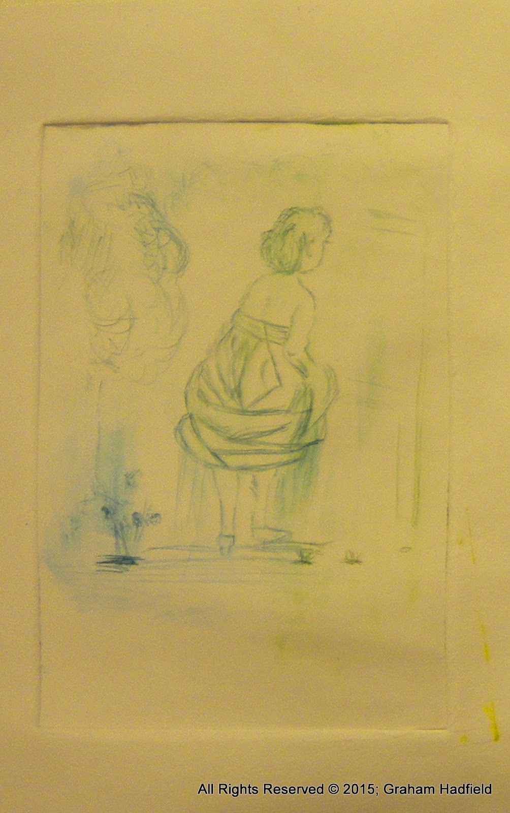
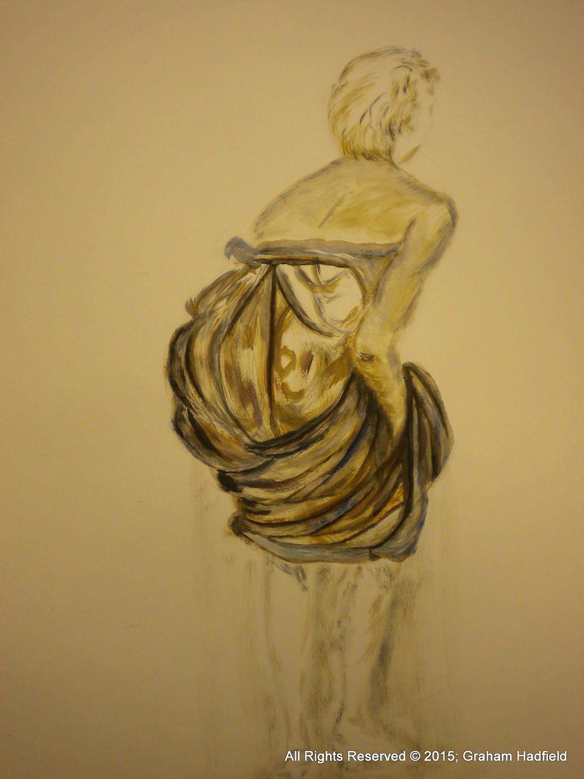
Having spent most of this week working on scales of the Charles Bargue drawing of "The Opinion of The Model" (1905) and re-interpreting it after an element of adaptation to a 6 foot by 4 foot scale, I worked on with the A0 size re-interpretation based solely on form, rather than line.  As per my previous blog, I'm reasonably happy with the result...


An idea occurred to reduce the drawing into a very small dry-point etch measuring 6 inches by 4 inches.  This was very much an experiment in this new medium for me, so the first attempts were rather naive...

 Exploring the results made me realize that my interest lay again in the drapery of the model's dress, and so some more experimenting was done, this time, by using some satin / silk style cloth arranged to maximise shadows and overlapping pleats...


This provided a primary source to just have soe fun!

My decision was to work in a large scale 6' x 4' mode, but this time, to try and remove any line or form from the object completely.

The resultant mess is what one might expect... Although I think there was some genuine expressive drawing going on with my 3" brush, I do not think the result has the kind of well conceived polish that I try to strive for.  Nevertheless, I did feel myself getting lost in the work at times, and my yearning for representation was almost lost in the abstraction of the dress.  My thoughts wandered into another project using electronics, and these were symbolised into the painting in a rather mind dumping manner.  I think it eventually worked in a way, but I would be grateful for honest comments...

Artist Review - Philip Guston

Philip Guston is probably most famous for his painting, "Painting, Smoking, Eating, Sleeping", and the variants of it, which run into many indeed.


 Painting, Smoking, Eating. (1973)
oil on canvas, Collection Stedelijk Museum, Amsterdam.
A Canadian by birth (in 1913), he moved from Montreal to California, (the son of Ukranian Jewish immigrants Family name "Goldstein", who escaped the Semitic persecution of Jews from much of the wider Europe prior to the first World War).   Unfortunately, the move from Canada to Los Angeles was a little miscalculated as there was also much hatred fro the Klu Klux Klan in those days.

In terribly sad circumstances, the young Philip Goldstein, (now Guston), at only 10 or 11 years of age, found his Father's hanged body in their shed, whom had apparently committed suicide.

He then begins to draw & paint around the age of 13-14 and later enrols on a correspondence course to Cleveland School of Cartooning. (This was the era of Walt Disney an was no doubt a wonderful escape from reality for the young lad). (Ref; http://www.themorgan.org/sites/default/files/pdf/press/GustonChronology.pdf)

He then has the awful spectre of seeing his older brother loosing his leg to gangrene after a motor cycle accident.  This must have been a deeply scarring time for young Philip.

During his initial formal art training, he meets and befriends Jackson Pollock, with whom he remains good companions (until Pollock's own suicide in the 1950's).

Through the 1930s and 40s he and friend Reuben Kadish (Another american born from immigrant Russians), has many adventures through travelling in Mexico, and no doubt during this time picks up many cultural influences from Mexican / Spanish and European backgrounds.

Finally settling in New York (spending time with Pollock, De-Kooning, Rothko and many others of "the New York School").  It is unclear from my research that he met Arshile Gorky (1904 to 1948), who I believe must have had very similar childhood, parallel immigrant suffering in the US (Gorky was an Armenian Genocide refugee) and also a strong mutual friendship with Jackson Pollock, Willem De-Kooning and others.  Unfortunately, like many others of the New York School, Gorky also committed suicide, (in 1948).

Gladiators (1940) New York (MOMA). www.moma.org


Thursday 26 February 2015

An Interesting afternoon at the Mission!

Today was quite a special day for me.  It was the first day I volunteered to work in the local town's Christian Mission.  Not something for the faint hearted I must say!

Today also marked the 10th anniversary of my old dad's passing and the throwing of his mortal coil...  So it's probably going to be a date that will stick with me for a while!

The volunteer-ship at the Huddersfield Christian  Mission had been undertaken to help a 3rd year (mature) student who also volunteers with the group.  In it, he provides simple art classes to the less fortunate in our society, many who are afflicted with mental health issues, alcohol dependency, drug use, homelessness, and in some cases, all of these at once!  So I kind of knew who the likely client base might include in a round about way.

I should point out that I'm not a cymbal bashing religious sort.  In some ways (even though on official documents I'm a Church of England 'ticker', - more for convenience and sort of conformism), I would describe myself as being without any one single religion, as there are parts of many religions that I agree (and try to conform to), and at the same time, disagree with other points.  Ultimately, I suppose I live within my own moral code, never to cheat, never to steal, never to knowingly insult or upset anyone, and as much as is safe to do so, to help those in need where I can, but without detriment or danger to myself or others.  I'm a keen smile maker.  I get a lot from seeing other people smile!.... So, that's me.  If there's a formal name for a religion for me to fit into, then I'm happy to conform, but I suspect there are many.

So, back to earth.  The reason why I decided to help my 3rd year pal was to help those less fortunate than myself, by giving some time to them.  They've probably had it pretty hard for much of their lives, but they still deserve respect.  Why not? Even if they've fallen on hard times more recently as adults, there is still some spirit within that could do with a bit of attention, - and respect.  

My first afternoon was certainly a baptism in deep water.. (no pun intended, ... - ok, - well only a little bit then).  My chum, the 3rd year student who agreed to take me under his wing for a while at the mission, was ill, so couldn't attend afterall!    So I really did have to jump in at the deep end to some degree.   I swallowed my anxieties and just got stuck in to encouragement and praise for whatever the various group members were doing. This was also made a lot easier however, thanks to one of the Mission's leaders, who knew most of the visitors well and was generally on first name terms to most of them.  He was ably assisted together I'm glad to say, with two other student helpers, - both, incidentally from the nearby University, but nursing / psychology students... who probably knew a far lot more than me in how to engage with the members of the group and no doubt better equipt to communicate with their special needs than I.

  Nevertheless, my very nervous and unsure start soon dissipated.  I got down to just chatting and encouraging the folks and a little bit of guidance, or doing a quick drawing for them perhaps (today, they were "doing Sharks" as a promotional activity to help a campaign to "Say No to Loan Sharks!"  The task had already been set by my friend the previous week, so folk were just getting on with some more of the same).

An example of one of the attempts, from a lady who was clearly pleased with her work, is proudly show here;

The intention is to get a number of these drawings from the visitors and chose one to be printed  (probably by screen print or transfer) on to ceramic mugs for the mission, to promote both the "Say no to loan Sharks" campaign, and to help promote the Christian Mission itself.

Generally the session seemed to go well, and the two hours soon passed to finish on a reasonably high note for me, in that I felt I had contributed, even just a little bit.

I will try to work out what I can do to help further in my next week's session, and then after a short break, I can return too provide further exercises.  My initial thoughts is to help them individually get a sense of achievement, however small, to give just a little pride to lead to the road towards more confidence and better self-esteem.  Not an easy or quick task by any means, but gentle guidance I hope I have in abundance to share...


Wednesday 25 February 2015

Reflections on the painting of 'The Opinion of the Model'

Having re-painted the original earth colour charcoal pencil drawing of Charles Bargue's drawing...

(with a little contemporary twist to the composition, only very loosely inspired by the artist John Currin, where instead of the Model looking at work on an easel, my version has the model in exactly the same pose, but standing in front of a bed.  Hence my slight nod of respect to early Currin, although I don't have any desire to create the near pornographic images that his later style has followed.  My view of these later paintings by Currin, unfortunately is that he's just wanting to make a quick buck, and it seems, that these later works might command a higher value for him and hence sale price, for their titillation rather than artistic merit), I repainted it today for the third time.  This was after going back to the 6' x 4' foot version and attempting to re-work it with more subtle mixes of burnt umber and ultramarine to make a near black mix, and then progressively adding white to get the grey I wanted.... But I don't feel that it worked.


I am still too concerned with the large painting having the right lines, but by choosing to use a large 3" house brush, the outlines have become too obvious and are not enhancing the tonality or material form of the subject.  By going over the dark outlines of the first attempt, trying to make them less bold, has just muddled the paint / drawing I think.   If I were to compare it with some of the great master's works that I'm looking at as source material, then clearly, the results are way-off.   However, in my defence, my intent was to use the original master sources to use as model templates, and when combined with a contemporary approach to paint-drawing on a very large scale, the exercise was to help me loosen up my style, which to some level these exercises have achieved.

In the next painting of the Opinion of the Model, I've moved back to a smaller scale of A0 or 3' x 2' approximately.  This is just for ease of storage and to experiment more than any other reason, although I have put a large 4'x6' Fabriano paper on my studio wall in preparation for the next painting....

So to summarise, the next paint-drawing of Bargue's "Opinion of the Model" - at the A0 size, was done with form in mind, rather than outline.  I've continued to use acrylics, although these are not the best medium for trying to replicate or represent 'form', as they appear to me to be very flat.  Whether that effect is because of the medium or because of my own lack of ability, - I am not certain.  I want to keep practicing in this medium of acrylics though as I want to improve my abilities in their use.

Overall, I think the effect is a little more pleasing on this third attempt, there is a better 3 dimensional illusion, but I have overworked the piece again somewhat.  Particularly the shoulder and back of the model, which might be better removed and re-highlighted for an improved result.  I will need to be careful that I don't overwork this version also.

Monday 23 February 2015

Contemporary Art in Context; Donald Judd, 'Specific Objects' - A Lecture by Dr A.J. Rowley, University of Huddersfield

Today we will be looking at the work of Donald Judd and his "Specific Objects".

So far in this series of lectures, we have been looking at two-dimensional drawings and images and also some three-dimensional sculptures.  We are now moving into the rounds of three-dimensional sculptures which are neither sculptures nor paintings.

In the book entitled "Modern Sculpture Reader" which is a series of essays, by a number of different artists, and also contributed to by Donald Judd in 1963, - he makes a very clear point in the development of contemporary art, that the practices and identifiers of drawing, painting and sculpture, at this point in time in 'our' (i.e. in 1963) culture, begins to 'break down'.

Since the end of the 1950s the Whitechapel Gallery has been the vanguard of contemporary art.  Donald Judd was exhibiting here in 1970, - very close to the approximate end of 'modernism'.

The writer and art critique Clement Greenberg pointed out some time earlier, that each medium has its own qualities, when he wrote about such suggesting that painting equalled flatmates and two-dimensional allergy with the ability to create illusions, and sculpture equals three-dimensional is and had very traditional materiality.

However during the 1960s Robert Morris another artist, who was to make some exemplars of the new "Minimalist" sculpture, also wrote extensively about Sculpture and its' changes in an essay entitled "Notes on Sculpture",  and turned his thoughts and attention on sculpture creation (although he didn't think of himself as either a sculpture or a minimalist) and three-dimensional study.  In 1965 he wrote "specific objects" which was an essay of art criticism, written by an artist himself, making a linear narrative.  In his article, he says "half or more of the best new work that has come out in the last few years is neither painting or sculpture" he goes on to talk of the diversity of work which is neither one thing or the other it cannot be classified to define it clearly.  Classification can only be done after it has been written about by the critics themselves.

In this concept of painting and sculpture merging and being undefinable, consider the work by Paul Cézanne and his late works such as the forest scene "apart from etc".  In that painting, and it is clearly the painting, it is possible still to discern that there is representation of foliage entreaties and also the steps to a path leading through the centre of the painting.  Compare this against the works of the sculpture of Brancusi and "endless column".  The Brancusi work is made from a single piece of what with repetitive shapes carved out of it.  It is clearly a sculpture, even though it is flat it does stand and three-dimensional's.  To put these two works into contexts, Donald Judd describes these sorts of objects as "specific paintings or specific cultures" however, Judd also talks of the work by Jasper Johns "false start" (1959), of an expression of the brushwork itself.  In Jasper Johns's pencil technique's incorporated within the drawing or is it a painting or is it a sculpture, (Greenburg would've hated the work because it also includes text).  Therefore it can be seen that in Jasper Johns work it becomes neither painting no sculpture.
Many things were happening during the 1960s, as pop art was also a very new concept and many artists were including other artists work within their own.  (For example Frank Stella (1963) "Carl Andre", which refers to the scandal this minimalist exhibition of bricks placed at the Tate modern in the 1960s).  In other words art in a sense at this stage has lost its subject matter and categorisation.  The challenges of the nature of the object, and the nature of the Gallery are not only transposed, they are mashed.  Frank Stella's "object" is neither a painting no sculpture in so many senses.  It is in between a painting or sculpture and cannot be easily defined.

In another work of 1959 Lee Bonteque and his work on entitled object which was made in sections of steel, in this work it seems that printing becomes a sculpture or "a specific object", which is an extension between painting and sculpture.

A little later in 1964, Yayoi Kusama's work "compulsion furniture (accumulation)", has successfully created this in between-ness state in both the work and also its making, whilst the whole piece is equally making a feminist statement.  Consider also the work of Claes Oldenburg and his piece "small yellow pie" (1961), this piece creates a strange and peculiar concept of objects which were made from muslin soaked in plaster, draped over wire and painted in enamel.

Donald Judd also notes in the essay that "the use in three-dimensional's, allows the use of all sorts of new and different materials of industrial production".  For example, we can now paint with a fluorescent light.  We can even put a neon light into a gallery and call it art, like for instance, Dan flower things "Pink out of the corner to Jasper Johns" (1963), which was indeed a fluorescent light and the metal fixture made to create a "specific object" that is neither a painting or sculpture.  Pieces such as this were a radical diversion of art during the 1960s.

Claes Oldenburg's "Soft Switches (version 2)" is another example of an object, which was made from vinyl, filled with Dacron and canvas.  It is neither a painting or sculpture, although it's qualities make you think it might be both.

If we now move away from Donald Judd's essays and onto his own artwork, like  "Relief" (1961) which was made from oil on board, with an inserted steel baking pan, it creates an unique Judd 'specific object'.

Compare this with the later piece by Donald Judd in 1967, called medium; lacquer on galvanised
iron.  Compare this with some of the original sculpture such as Brancusi's wooden form.  Judd's work shows repetition, like Brancusi's, but it also shows separation, and the industrial materials of steel and lacquer is really an investigation about car manufacture.  This therefore means that the work, unlike Brancusi's, required industrial fabrication that the artist himself could not do.  To me it also has some illusions towards drawings, and it's qualities of defining tone shade lightness and darkness.  In fact if we scrutinise some of jobs drawings these were of such delicacy and accuracy, and yet were also used by these other fabricators, to manufacture the final works that job the artist had in mind.  He was often criticised for not being minimalist enough.  However, Judd never accepted himself as a minimalist.  He was generally working against the traditional ideas of sculpture, even though the classification of his work was often mixed with sculpture of the traditional sort.
(For example a very contemporary piece by David Smith in 1963 entitled "Qubes" which was a very contemporary object in that it was made from cubes arranged to look like human form and clearly a sculpture).

Towards the end of his career, for example, Donald Judd's "Painted Aluminium" (1991), -where the work is neither a painting or sculpture as it is a fabricated piece, in that the colours and their subtle changes cause a change to the whole objects' nature, and so, it also appears as sculptural form.

See a full and complete bio of Donald Judd at http://www.visual-arts-cork.com/sculpture/donald-judd.htm

Because of Judd's work in 1965 and his essay "specific objects", he created the start, and an enabler as such, to position were contemporary art is placed now, as "post-modernist".  Donald Judd's essay was therefore a key turning point in Art history.

Friday 20 February 2015

Drawing on a larger scale, - Review of Steven CAMPBELL & reflections of the week

I have enjoyed working at the much larger scale of 6' x 4' during the past couple of weeks and I feel that I am engaging in a much freer and demonstrative way with the medium.

The suggestion made by Prof Swindell to look at the work of Stephen Campbell and also that of Malcolm Morley has been very productive.  I recall seeing the work of Stephen Campbell when I visited the Scottish national Gallery in Edinburgh last year, and I was fortunate to be there when an exhibition of his work was taking place with a full gallery room dedicated to Stephen Campbell's work.


Stephen Campbell was an interesting character who sadly died quite young.  He was it appears a patriotic Scotsman, although I felt that in many of his paintings there was a disturbance, and his mind must have carried a number of demons that he needed to express through his work.  Prof Swindell recommended these paintings, I believe, because they hold an element of naivete in the way that the paintings presents itself, but far from it, the techniques are very advanced indeed.  Overall the images are extremely painterly and seem to capture what my tutors are trying to inculcate into my own style, in that I need to make my arts more descriptive, but not illustrative.

I desire to engage with the materiality in my paintings, which I do not believe is coming through yet, and I must take on board,  after the tutelage and comments from Prof Swindell and Dr Holmes, that I must be more ambitious, make the subject's more demonstrative. It's a hard task but a learning focus, that is this need to make the paintings more descriptive, demonstrative but not illustrative, that I need to pursue.

I am struggling in some ways to find something new to make, which is of value as either a medium, a strategy, scale or a new experience.  I appreciate the need now to build a new set or series of things, in which I can use the journey to explore, modify, and research through practice.


Whilst I continue to improve my drawing techniques at a smaller scale, perhaps at A4 or A3 size, at some stage I want to look at more contemporary practices of mark making through the use of new technologies.  I will keep this in mind over the coming weeks too.

Furthermore to extend the use of "appropriation" it is possible for me to use something from another process.  For example the photographic work by John Stezika, the redefinition by Paul Amar of seashells, or indeed the graphical work of Rebecca Szetso in her use of the Emir and Velasquez paintings.  These are a few artists but I also need to research in to.  The practice of up cycling, where discarded trash or rubbish items are reused in a totally different context or purpose is a very current contemporary art trend.  Further reading can be found at HTTP://scarfolk.blogspot.co.UK/ and also at www.E9fun.com

Wednesday 18 February 2015

Working at a larger scale, reflecting the process so far

By creating a detailed sketch in my sketch book, then re-creating the same image at a 6' x 4' scale, (approx.), - AND with the added quirkiness of reproducing the image upside down, has been a great exercise, and I must say, a new process that seems to work well for me too.

I have started to develop a slightly freer use of the brush in these larger paint-drawings, although I still have much to learn.  My chosen medium of acrylic on paper may not be the best choice, but in using just two colours for tone and ground and definition, it servs its' purpose.

The act of recreating a representation at such a large scale has both merits and difficulties, one of which, if not kept in check, is to run out of paper!... A simple mistake on my part, by not properly sight sizing the painting at the first engagement!...

But I got away with this...

Artist Review - Nigel Cooke, a new taste of realism and Surrealism

There are two artists by the name of Nigel Cooke, the most prominent is a Manchester born Artist, (Bn 1973), his mastery of mystical scenes is amazing....


Tate

Huddersfield Examiner article

Breeze Gallery

Personal Website


Monday 16 February 2015

Contemporary Art in Context; Louise Bourgeois, Insomnia Draawings. Lecture by Dr Alison Rowley.

Our study last week was particularly focused upon the surrounding culture going on around the artist William Kentridge, during the time that he was creating his artworks of Felix etc.  In this lecture we will drill down a little further into the psychology of some artworks, and in particular we will look at the work of Louise Bourgeois and her insomnia drawings.  The importance of the theme of these drawings lies closely with those of William Kentridge.  The ways and methods, not only in the sense of the narrative, but the materials themselves (black and white) were used very successfully by William Kentridge.  With regards to Louise Bourgeois it is interesting that she was still producing sculpture until her death in 2010.  As an artist she only came into prominence during the 1990s, even though she was producing work as early as the 1930s.

In her work named "Fillette" (1968), which is a work made from latex over plaster and is one of her most famous works, which is based on the appearance of a little girl, but it is also being created clearly like a phallus.


In another of Louise Bourgeois's works entitled "Maman" (1999) which can be found outside the Louvre, Paris Gallery, it is very similar to the work spider created in 1997, made out of steel, tapestry, glass and other materials.     The sculpture, which depicts a spider, is among the world's largest, measuring over 30 ft high and over 33 ft wide (927 x 891 x 1024 cm). It includes a sac containing 26 marble eggs and its abdomen and thorax are made up of ribbed bronze. Maman is a regular French

word used informally to denote 'Mother'.   A copy of this work can also be seen at the Tate Modern, Turbine Hall.  The original was cast in steel, with six subsequent additions as casts in bronze.

"The Spider is an ode to my mother. She was my best friend. Like a spider, my mother was a weaver. My family was in the business of tapestry restoration, and my mother was in charge of the workshop. Like spiders, my mother was very clever. Spiders are friendly presences that eat mosquitoes. We know that mosquitoes spread diseases and are therefore unwanted. So, spiders are helpful and protective, just like my mother."
                 - Louise Bourgeois, (Retrieved from the Tate Modern Website, 16 Feb-2015).
A whole book has been written on Louise Bourgeois's spider by Meike Bal.

It is also worth considering the works "Cell" (i.e. Eyes and Mirrors) 1989 to 1993.

In her series entitled personages series, 1947 and the works Foret (Night Garden) she made all of these in New York in order to quote 'keep her company.  In her 1970s work "Femme Maison", this is a clear statement of feminism.  This may have come from the time that to Louise Bourgeois attended Stanley William Haiters Atelier 17 in Paris during the 1940s, during which time she completed the work "he disappeared into complete silence" 1947.

After not much success in her newly adopted home during the 1940s of New York, she joined  the Amarican Abstract Artists group in 1954, which included Jackson Pollock, Willem De Kooning, Mark Rothko and others.  By this time there were also many surrealists including Marcel Duchamp who had moved to New York.  However they were not interested in Louise Bourgeois's work as a woman, and therefore she developed a strong interest in trying to change opinion and improve the situation through feminist statements.

It is sad that after her death, there was a huge exhibition of Louise Bourgeois's works at the fruit markets in Edinburgh.  In particular focus was her drawings which in 2013 brought a completely new dimension to her work.

These insomnia drawings were created between November 1994 and June 1995, during which time she made over 220 drawings (a book is available in the Huddersfield University library which details each of these drawings), the original's are now in the demo's collection in Switzerland.  These drawings have now become some of the most important works.  They have been written about extensively to, and parallels can be drawn to the work of sleeplessness in Kafka's and other artists which is of particular interest.  Kafka said "dreams are of infinite richness for a radical encounter with oneself.  It is a crossing of sleep with wakefulness, the insomniac can enter a phase of total concentration."  And there is also this sense of loneliness to the insomniac.  The drawing allows you to do something differently.

Much of the above can be seen in the book by Elizabeth Grantham.

The Louise Bourgeois abstract drawings still appear quite organised.  They have been classified as surrealist automatic drawings for example by those such as Paul Klee and his automatic drawings and the statement taking a line for a walk.

Elizabeth Grantham talks about the two states of mind of consciousness but also what you can't see.  It is a special sensation in her subconsciousness in a state of ambivalence in plenitude and the dual state of calmness and anxiety.

The very essence of drawing the pens on lutes; the freedom of how work is constructed tends to make work when very tired become more abstract.  Consider the writings of Sigma and Freud and the subject of is split consciousness and unconsciousness.  He stated that dreaming flushes out our anxieties.  Louise Bourgeois was intensely anxious and the knowledge of dreams shows this.  The between state of insomnia produces art that is quite unique amongst all artists.  To catch such special images (like in the comment of William Kentridge when he says that the creative part is done in the walk between the ease of the camera), it is very similar to Louise Bourgeois and the state of fluidity captured in between dreaming and waking.

Water and fluidity play highly in the work of Louise Bourgeois, which can be clearly seen in the insomnia works themselves.  An interesting question may be posed in that what is the value of drawing with pencil and paper in the new technology age.  I feel that the spaces in between, as in William Kentridge's statement during the walk, may actually be lost.  The anxiety of Bourgeois is from her abandonment by her father early on in her life.  These anxieties can also be explored further as the subject matter truly is a study of truth and trauma, memory and experience, both in her art and her writings as recorded by Elizabeth Grantham.

Sunday 15 February 2015

Paul Noble - Artist review, - re-visited.

Following on from the work I did last week, and my subsequent conversations with Prof Swindells, Christian and Dale, one of the artists that was suggested that I take a look at is Paul Noble.

Paul Noble is an English craftsman painter and installation artist.  He attended Humberside College of higher education and completed his degree in fine Art in 1986.  He was given a nomination for the Turner prize, together with a number of other artists in 2012.  Interestingly, he is exactly the same age as myself, having been born in 1963.

My favourite phrase of his is...    "Allow yourself to imagine!"  (Paul Noble, 

Much of his work has been recognised by a unique signature of architectural buildings, very much in, in my humble opinion, and arabesque style.  His streets and town use almost encourage a spectator lose themselves in a maze of winding and narrow alleyways.  Every so often there are town squares, as open places, which in many of his drawings may be decorated with some kind of phallic statue or monument within it.
 One of the most famous creations that Paul Noble has continued with as a theme is his town called Nobson Newton; a completely fictional town which comes purely from his imagination.

It's only after very detailed scruitiny that you realise that there are in fact, many letters of text concealed in his drawings.


Take for instance, Newton Central, which is totally loaded with letters, that have actually come from the poem...

April is the cruellest month, breeding
Li
lacs out of the dead land, mixing
Memory and desire, stirring
Dull roots with spring rain.
Winter kept us 
warm, covering
Earth in forgetful snow, feeding
A little life with dri
ed tubers.
Summer surprised us, coming over the Starnbergersee
With a shower 
of rain; we stopped in the colonnade,
And went on in sunlight, into the 
Hofgarten,
And drank coffee, and talked for an hour.Bin keine gar Russin, stamm’ aus Litauen, echt deutsch.
And when we were children, 
staying at the archduke’s,
My cousin’s, he took me out on a sled,
And I was frightened. He said, Marie,
Marie, hold on tight. And 
down we went.
In the mountains, there you feel free.
I read, 
much of the night, and go south in the winter.

And in Nobson Newtown, these appear as;

APRIL IS THE CRUELLIST
MONTH DING LACS OUT OF
THE DEAD LAND, MIXING
MEMORY AND DESIRE,
WARM COVERING EARTH
ED TUBERS. SUMMER
SURPRISED US COMING
OF WE HOFGARTEN.
AND DRANK FOR AN BIN
KEINE GAR DEUTSCH
STAYING DOWN MUCH
OF IN WINTER


His pencil drawings are particularly detailed, often depicting people going about their business in an aimless and nonsensical routine.  Is drawings are also particularly interesting from their sense of perspective and can cover a huge expanse where it seems the artist has entered into a state of meditation with endless doodling and repetition of the architectural box theme create a world that sits somewhere between humour on the first glance, but despair and monotony in the more deeper analysis.  This is an illusion of the utopian city being transformed into the modern day dystopia that our existence and civilisation appears to be travelling towards.  In his later works, there is a noticeable lack of people which used to occupy comicstrip drawings which were presented with his earlier works.  This dystopic notion of bleached white cities with no inhabitants draws parallels to contemporary town planning in some parts of our own world, where it appears that the needs of people have been abandoned for the sake of architectural elitism and the notion of unneeded testicle elegance by the architects themselves.


He exhibits works all over the UK, including the Tate Gallery, the Laing Art Gallery in Newcastle upon Tyne, and of course the city racing Gallery in London, for which he is one of the founding members, together with five other artists who created a cooperative between 1988 and 1998.


Saturday 14 February 2015

Artist Review - John Currin, - Old Master's Techniques, but twisted into contemporary shock

John Currin is an American Artist, perhaps most recognised for his depictions of his wife, often posing naked, with rather shocking content and somewhat twisted representation.

Whilst his techniques are quite remarkable, I'm not sure if the subject matter and content is suitable for my artistic progression, nevertheless, with regards to his skills,  it's food for thought!

Gagosian

Tate

Wikipedia

Friday 13 February 2015

Studio Practice - Reflections on the week's progress, Appropriation, Interpretation, Adaptation


As I'm keen to continue in the study mode of the Atelier, I took some time to read some of the Material of Harold Speeds' wonderful book, written in 1905 called The Science and Practice of Drawing.

Whilst showing this to Prof. Swindel, he was not entirely giving me the impression that he agreed with my choice to study drawing in the classical way.  I accept that this is perhaps a rather laborious route, and may not necessarily lead to a commercially sound means of getting myself a unique identity, which it seems, is the most important focus for a contemporary art student to gain.  Nevertheless, he did come up with a quite novel way for me to bridge both my own desire for classical study, together with a mechanism to "loosen" myself up. It was to use these drawings to paint on a very large scale, he suggested potentially the whole of my studio space wall.  Which I duly did, coveering a large Fabriano paper of 6ft * 4ft proportions, AND, by doing the study upside down!

I think it works, and he too was pleased with the results...


It produces a strange result, something I need to explore further...

In the meantime I have put aside drawing by started last week.  Basically this was just a kind of doodling and I started at a time when I was unsure of where to take this project.  Nevertheless it has developed into a nice record of my peers as they breezed in and breezed out, just like the autumn leaves which is alluded to in the top of drawing. 


Initially I was a little bit disappointed with the feedback from the tutorial that I had with Prof Swindel.  The reason for my disappointment was that he felt my drawing was still rather amateurish, and in that the subject matter, whilst convenient, didn't really express any transformation before my art making.  He has a fair point.

My tutorial with Christian was however a little more productive because I explained my initial concept of the second part of the project and my decision to base it upon the theme of Tumbleweed.  I like the phrase he used which originally came from Paul Noble which was allow yourself to imagine.  This deals with the subject of the awkward silence, which Christian feels is a much richer source of material for me to adapt interpret and appropriate.  There was positive encouragement for my drawing in the sense that whilst I am not a virtuoso, the concept of one key drawing or a drawing of that is either out of place or slightly missed dimensional and, can have a good impact.  For example the work of El Greco and also the works of Giorgio De Chirico, about the absence of things.  Another source of material which would be useful to read and to look at would be that of the works of Edward Hopper, in which he tackles the phenomenon of waiting or "awkward moments".  The same awkward moments during waiting can also be seen in a number of Victorian domestic "melodrama" paintings.  In these types of paintings, the "stiffness" of English culture is explored with stories that also contain a message.

Further works to look at might be Ed Kienholz and his portraiture and sculpture, which can be found in the Beanery-cafe in Amsterdam, which proved to be an alternative approach to realism.

Wednesday 11 February 2015

Expanding ideas on interpretation, appropriation and adaptation

Thinking through the need to improve my drawing skills my creative practice can respond to a self negotiated element, and in particular the theme of adaptation is possibly the most illustration-al piece.

With regards to adaptation, a strand briefing conducted by Christian Lloyd helped us to consider the "evolution" of George Orwell's 1984 book covers, a novel which was initially published in 1948, as a metaphor for the post-war society.

 Under scrutiny, the book covers have changed significantly from the original published version, above, then adapted to a more sophisticated marketing device in the 1950s version which was an image silhouette of the backdrop of a large modern cityscape. ...

 It then developed through subsequent publications to the idea of the famous Lord Kitchener poster (which originally stated "Your Country Needs You"), appropriated and adapted / changed to "Big Brother is Watching You".
The changes on the book cover can also be seen through the actual typography and the recasting of the aesthetic to the latest contemporary cultural signifier of the time, for a further example the artwork by Ben Jones and later covers, which suggested that technological advances in the contemporary culture of the time, and the inclusion of barcodes, and then later again to the most recent publication of the 21st-century and the design by John Vallance of the "redacted" style which consist of the name that blackened out with horizontal bars.


Another example of adaptation which also includes interpretation is that of the work of Simon Starling in his piece shed boat shed (2005) where the viewer is invited to read, interpret, adapt and then represent.

If we now turn to interpretation, and drill down on the meaning of that theme, synonyms might be "reorganise, filter, sort, reposition, prioritise based on a value-based system.  Alternatively this could also mean redesigning.  Design and craft and its meaning of interpretation in art sits well in the field of contemporary art and illustration.

A good reference site or this might be the design Council website at www.design Council.or.UK/news-opinion/introducing-design-methods

This process which covers the four elements of design which are the discovery phase, design phase, development phase, and delivery phase; reminded me very closely to an industrial process based on motor roller research called six Sigma in which they have to streams one based on the design of the new product and the other stream of equality improvement of an existing product.  In the six Sigma methodology phases for a new design are define, measure, analyse, implement and control.  And for product improvement the phases would be define measure analyse develop verify.

And finally if we consider appropriations, the synonyms and meanings of this could be "using something for another process" for example the works of John's basic and his re-use of photos to create alternative forms of art.
Paul Aymara and his work which uses seashells as a basis for his art to redefine their function another process.
And finally Rebecca Saito and her use of the existing artworks by the mere and Velasquez.

There are few websites which may be worth looking at such as HTTP;//ska folk.blogspot.co.you are/
E9 fun.com

Another area in contemporary art which is gaining pace and fashion is through up cycling.  This particularly fits into the appropriation of materials originally designed for one use and being adapted to create art for another use.  See the work by Jason Peters or up cycling examples.

Another exercise which we could engage with is to see how each word can play against each other is a combination of appropriation, adaptation, and interpretation.